B2B SaaS Platform | FinTech

Designing an Employer Control Center for Earned Wage Access

Transforming chaos into strategic control

In high-turnover industries, employers often manage Earned Wage Access (EWA) through a chaotic web of emails, chats, spreadsheets, and shift logs.
This fragmentation leads to a significant “blind spot” regarding how wage access affects cash flow, compliance, and staff retention.

As the Lead Product Designer, I spearheaded the creation of a B2B Employer Control Center that transforms this operational chaos into a strategic advantage.

The platform unifies a fragmented ecosystem-employees, payroll and scheduling systems, and banking/payout layers into a single, coherent employer control center. This integration supports the core objective: enabling fast, confident managerial decisions while systematically reducing compliance risk through automated, policy-driven workflows.

EWA EMPLOYER ECOSYSTEM
The complex environment we unified

ALIGNING USER AND BUSINESS GOALS
Our target: fast decisions & compliance safety

Duration

4 Months

Product

B2B Saas Platform

FIELDS

FinTech

The Challenge

When Payroll Loses Operational Control

Employers were managing wage requests across disconnected tools with no single source of truth. This lack of integration forced managers and HR teams into manual cross-checks, resulting in three primary operational losses:

Blind Spots: No shared view of risk, policy violations, or the program’s impact on retention.

Lack of Truth: Disconnected data across scheduling, payroll, and banking tools.

Manual Overhead: Informal requests requiring tedious manual verification and approval.

Competitive analysis shows no insight-driven employer view

Competitive analysis across direct and indirect EWA solutions revealed a clear gap. Most platforms either prioritize the employee experience with minimal employer control, or offer heavy admin systems overloaded with raw, fragmented data. None provided an insight-driven employer view that connects daily approvals to business outcomes such as risk, liquidity, and retention.

This gap defined the opportunity: a control center that absorbs operational complexity in the background while keeping managerial focus on clear signals, priorities, and ROI.

Comparing employer visibility, decision support, and business impact across existing platforms.
Mapping direct and indirect EWA (Earned Wage Access) competitors, including analysis of user reviews, to expose gaps in employer control and insight.
The Process - The “Aha” Moment

From Visibility Gaps to Readable Signals

During the research phase, a recurring sentiment surfaced among managers: they felt they were “approving in the dark”. The core problem was not just the workload of the approval itself, but the lack of context. managers couldn’t see if a decision made sense in the bigger picture.

“I don’t actually see what’s going on... "

Affinity Mapping exposed the absence of insight-driven employer decisions

This allowed me to cluster pain points from various personas, such as HR managers at retail chains and small business owners. This research shifted our focus from simply managing a process to providing transparency into patterns, trends, and risk impact.

Through Infinity Mapping, a clear pattern emerged: employers were struggling to make decisions without a holistic view of trends, risks, and usage patterns.

Design pivot from data scanning to readable signals

Instead of forcing managers to scan rows of data, we introduced unified KPI and wellness cards that communicate state and trend at a glance. This approach reduces cognitive load and immediately increases decision confidence.

BEFORE

Fragmented tables and charts required manual scanning to interpret program health, risk, and employee behavior.

AFTER

Unified KPI and wellness cards surface clear signals at a glance, enabling faster, more confident decisions.
strategic direction

Defining a decision-driven product strategy

This phase set the strategic foundation of the product.
The goal was not to optimize workflows, but to design a system that consistently guides managers from signals to decisions, and from decisions to measurable business impact.

HMW questions reframed the problem around decisions, not data

To translate these insights into a clear product roadmap, I addressed a set of “How Might We” (HMW) questions, specifically: 

Mind map translated strategic pillars into a scalable product structure

We organized the platform around these pillars, which shaped the core product areas: the Overview Dashboard, Transactions, Employees, and Reports.

Mind map showing how the pillars informed the product structure.

Strategic trade-off shifted the system

From data-heavy overviews to insights-first decisions
A critical decision involved the dashboard structure. I weighed a Data-Heavy Overview (Option A), which mirrors traditional HR tools, against an “Exceptions & Insights First” approach (Option B).

We chose the latter, applying Hick’s Law to ensure that instead of being flooded with choices, managers are presented with a focused KPI row and macro visuals first.

Option A

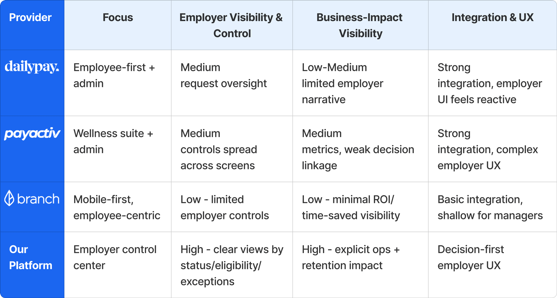
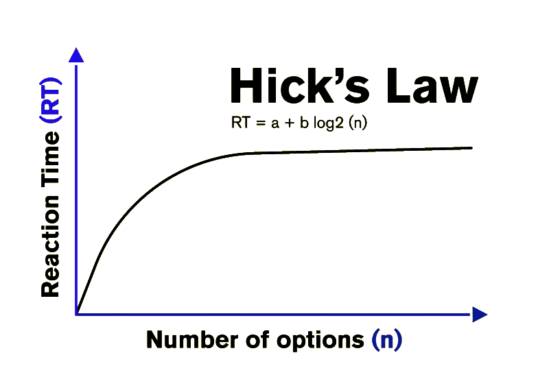
Long decision-making time

Industry Pattern (Data-Heavy Overview)

Traditional data-heavy dashboards common in HR and payroll tools.

Option B

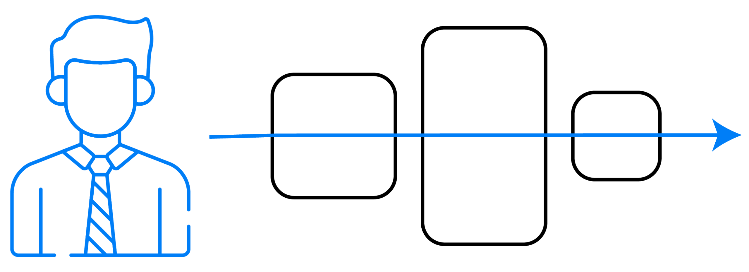
Short decision-making time

Chosen Direction (Exceptions & Insights First)

Exceptions & insights-first overview designed to reduce decision friction.

Information architecture connected overview signals to focused action

The structure connects the high-level program overview to detailed event-level views like Employee Details and Transactions, guiding users seamlessly from “what” to “why” to “who.”

how Employees & Transactions fit into the broader employer control center
The Solution

A Decision-First Architecture

Every screen follows a consistent pattern: signals and exceptions first, tables second-guiding managers from ‘what’s wrong now?’ to ‘what to do about it’. 

The user flow translates alerts and data signals into clear operational action

This flow maps the employer’s daily routine: from logging in to understand today’s workload, through handling flagged requests, to reviewing the impact of those decisions on overall program health.

A clear employer journey – from daily alerts to resolved actions and measurable impact.

Dashboard Overview – Setting priorities and decision focus

This serves as a “priority-driven” rather than a mere report. It features a top KPI row (active employees, adoption rate, time saved) and insight charts that compare company performance to industry averages.

Highlights what matters now, then lets employers drill into pending and recent requests when needed – optimized for clarity, focus, and fast, confident decisions.
Top KPI Row

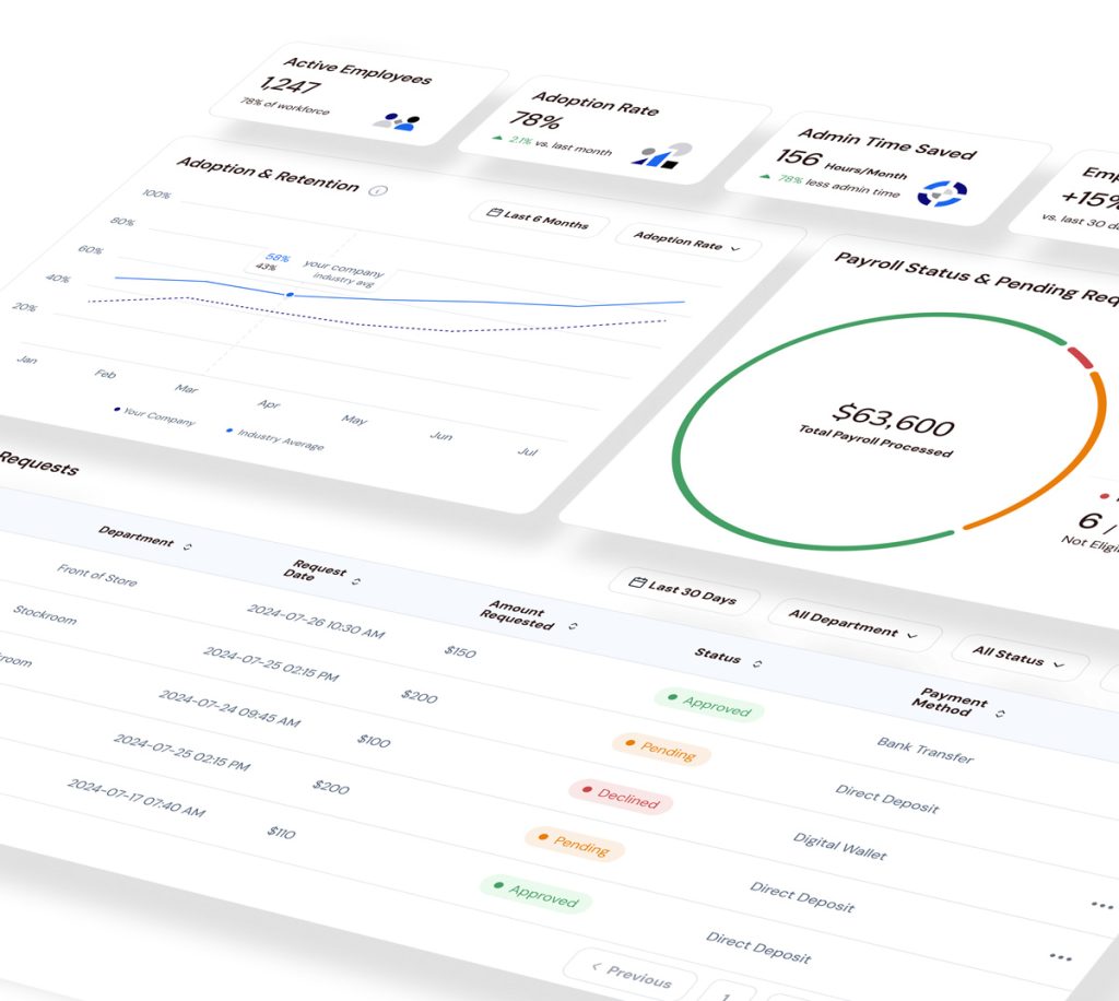
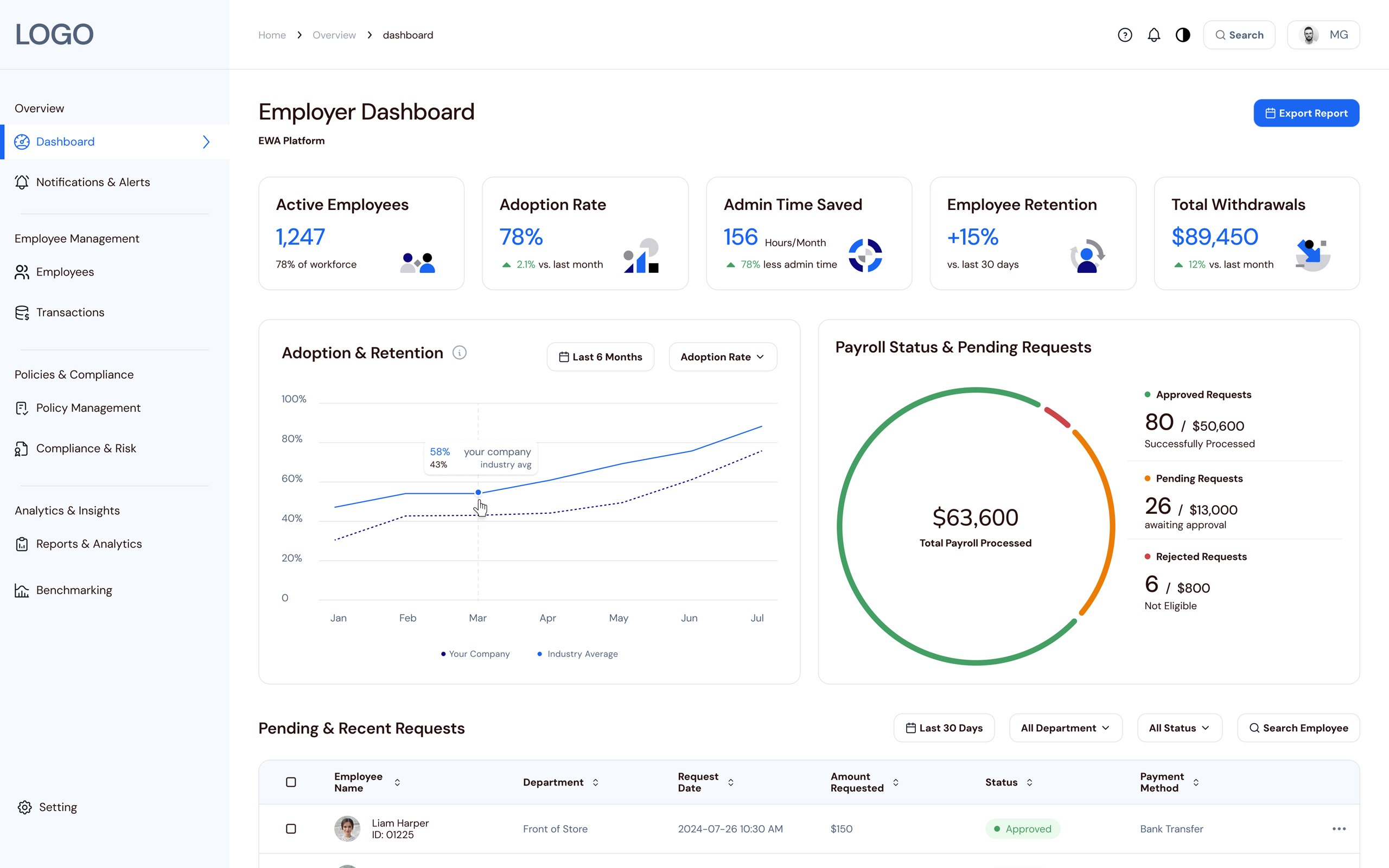
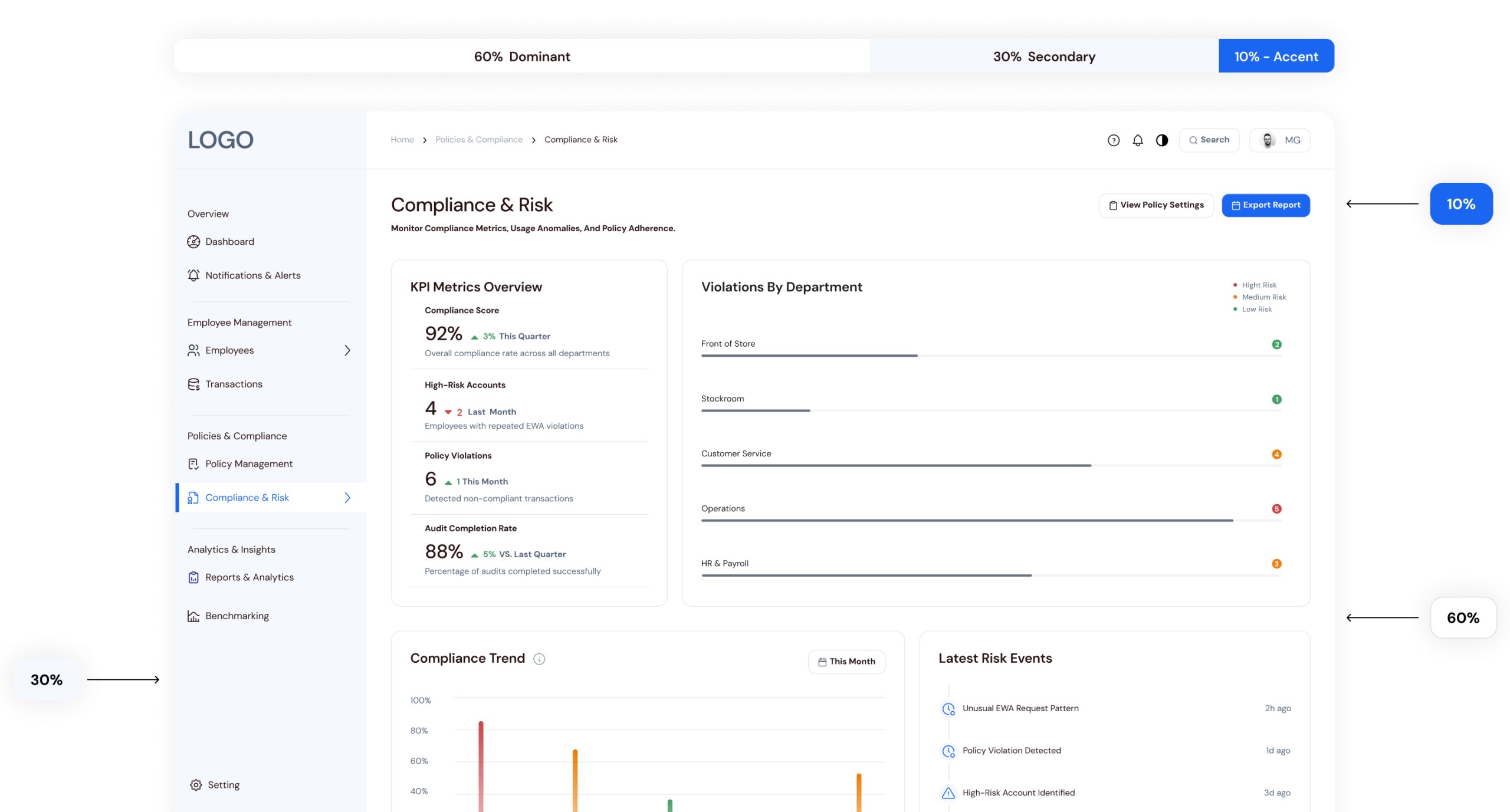
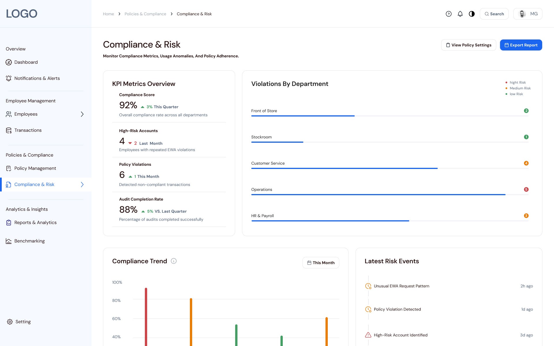
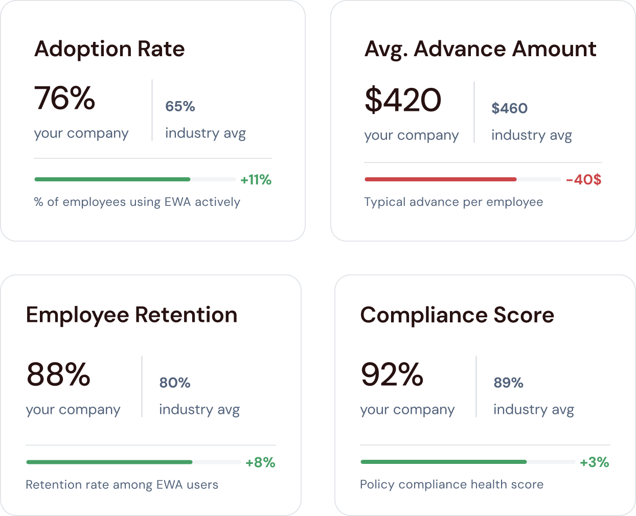
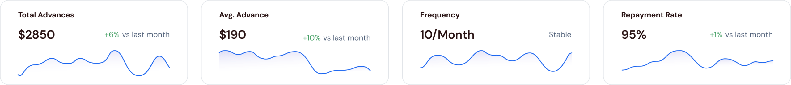
A focused KPI row so employers can quickly see whether the program is used, saving time, and supporting retention.

Insight Charts

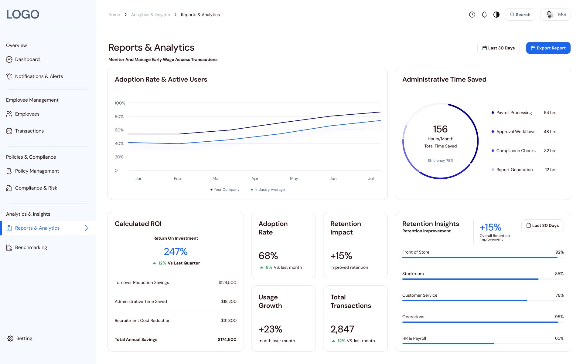
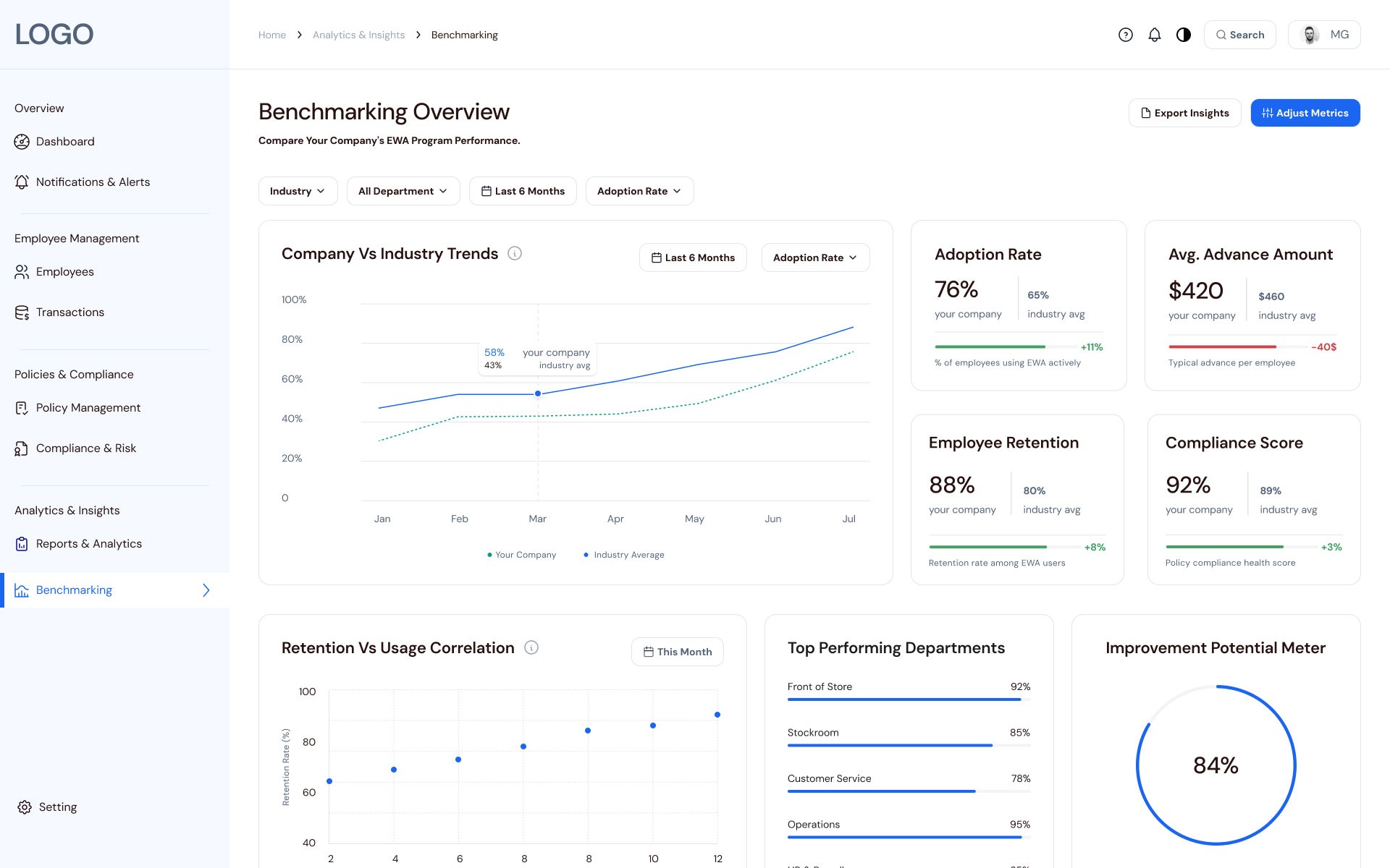
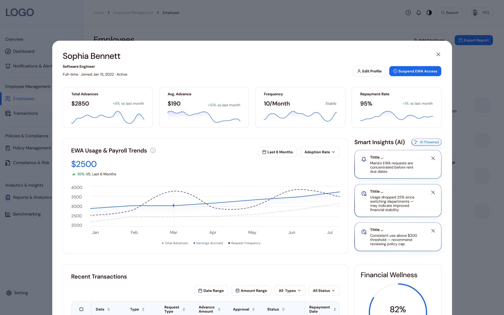
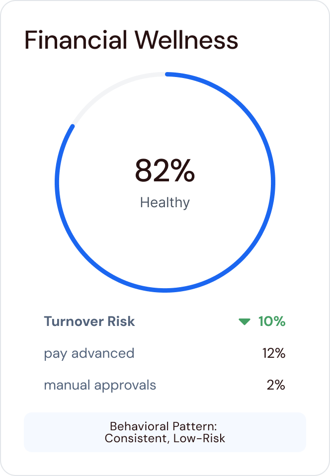
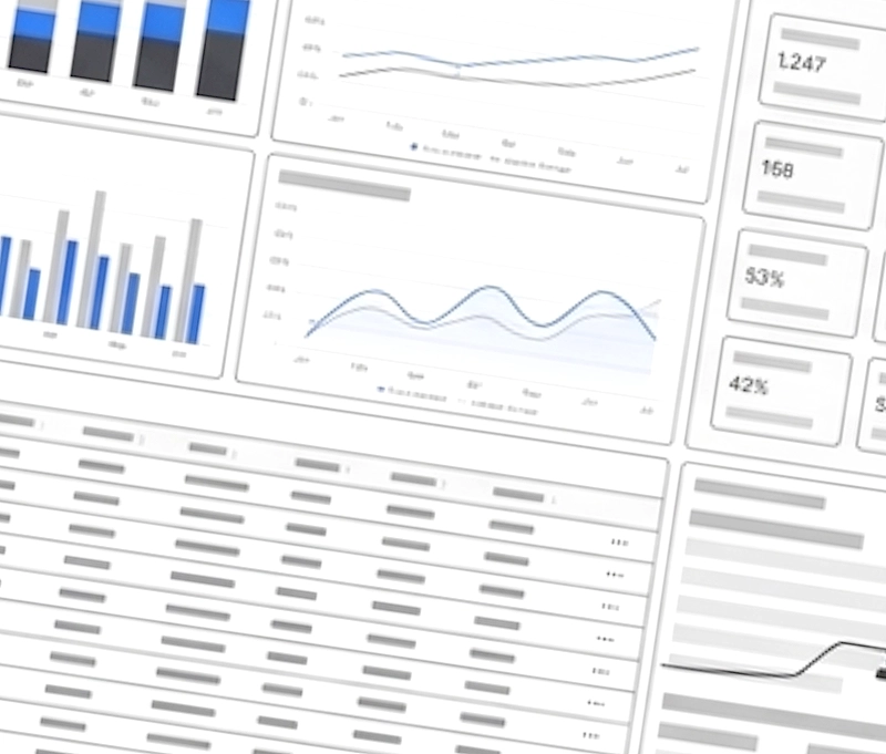
An Adoption & Retention chart compares company performance to industry averages, while the Payroll Status & Pending Requests donut summarizes approved, pending, and rejected requests, revealing both long‑term impact and today’s decision load.

Pending & Recent Requests Table

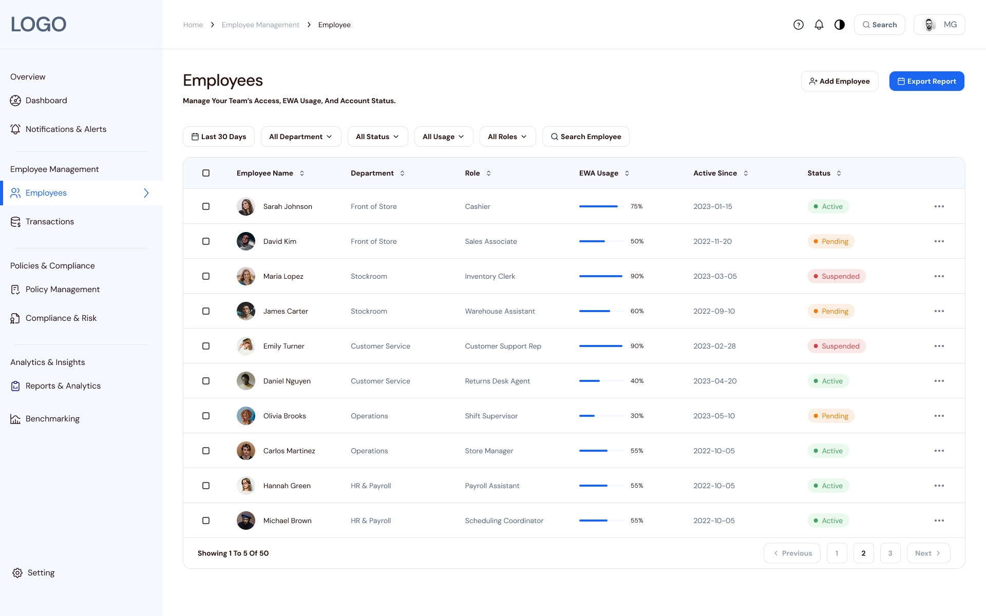
A single Pending & Recent Requests table, with filters and per‑row overflow actions, provides the detailed view of individual requests without overwhelming the entry screen, keeping transactions as a controlled second layer.

Compliance & Risk – Surfacing risk early to prevent reactive decisions

Applying a decision-first hierarchy, this screen uses the 60-30-10 color rule to draw attention to critical alerts and policy violations. It surfaces “where the problem is now” before showing detailed tables.

Designed to prevent policy drift and reduce compliance risk before payroll cutoff.

Employee List → Detail Card: From team-level patterns to individual context

This view allows for a fast operational scan. A slide-in detail card provides “Smart Insights” (AI-powered), flagging behavior patterns—such as clustered requests before rent dates—that require manager intervention.

List-to-detail flow enables managers to scan team patterns and drill into individual employees to identify behaviors requiring intervention – without losing context.

Transactions – Handling exceptions through signals, not raw tables

Intentionally not “table-first,” this screen starts with KPIs and exception signals like pending requests and policy violations. This ensures managers investigate only after higher-level signals are identified.

Transactions serve as an event layer for requests, exceptions, and violations – supporting investigation only after higher-level signals.

Reports & Analytics – Translating activity into executive-level insights

This view flips the lens from daily tasks to an executive performance narrative, focusing on adoption velocity, operational leverage, and business outcomes like recruitment cost reduction.

Reports & Analytics translate operational metrics into executive decisions – helping leaders decide whether to continue, expand, or adjust the EWA program.

Benchmarking – Validating performance against market benchmarks

To support strategic validation, this view compares internal EWA performance against market averages for adoption, retention, and compliance.

Benchmarking validates competitiveness by placing internal performance in market context.
Learnings

Learnings & Reflection

This project demonstrated that a “simple dashboard” becomes a vital organizational control center when designed around decision-making rather than just data entry. By prioritizing decision-ready insights over raw data, we moved managers from “figuring out what happened” to “deciding what to do next”.

Key Lessons:

Decisions over Features:

My initial concept tried to fit every action onto one screen, leading to analysis paralysis. Reorganizing the flow around specific "decision moments" optimized the signal-to-noise ratio.

ROI Storytelling:

In B2B SaaS, the design must clearly articulate value to leadership-time saved, risk reduced, and improved retention-not just "better usability".

Trust and Transparency:

In FinTech, elements like audit trails, risk indicators, and policy clarity are as crucial as the visual polish.

 As the Lead Product Designer, I reframed EWA from a mere payout feature into a strategic lever. By aligning cross-functional stakeholders around a shared definition of success, we built a system that proactively surfaces risk and financial wellness signals at a glance.

Simplified navigation

navigation errors
- 1 %

Clear dashboards

faster decisions
+ 1 %

Seamless UX

task completion
+ 1 %

Analogy for Stakeholders: Think of this platform as an Air Traffic Control Tower. Instead of requiring the controller to manually check every bolt on every plane (the raw transaction data), the system monitors everything in the background and only alerts the controller to the planes that are off-course or need immediate clearance, ensuring the entire airport runs safely and efficiently.

Thanks 🙂