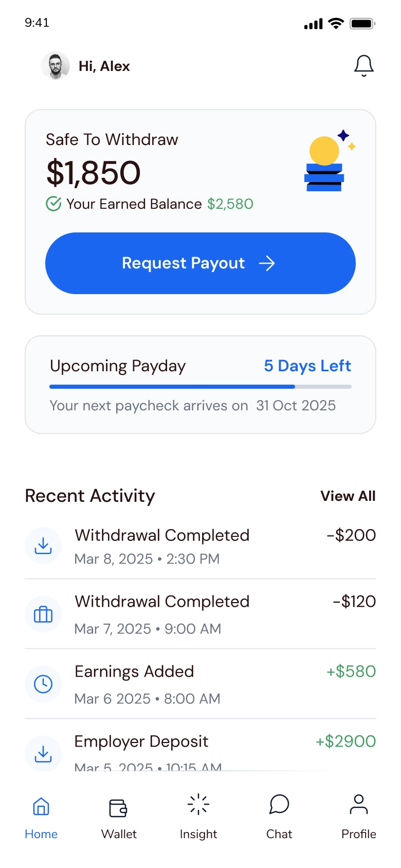
Faster selection:
Min and max are visible, with quick amount chips instead of trial and error.
B2B2C - Mobile App
An Employer-Backed Early Pay App Employees Trust
From paycheck stress to clear, predictable withdrawals
The Employee Mobile App gives employees employer-backed early access to wages they’ve already earned – through an experience that feels simple, transparent, and safe.
The core loop is designed so an employee can open the app, understand in seconds what’s safe to withdraw today – and why – then complete a withdrawal in a short, repeatable flow, with fees, limits, timing, and paycheck impact shown before confirmation.
I designed the app to avoid loan-like patterns by keeping earnings context, guardrails, and status visibility explicit, with optional financial insights as a secondary layer. Success was framed around trust and predictability: fewer “how much can I take?” doubts, clearer expectations on timing and fees, and confident repeat use.
Duration
4 Months
Product
Mobile App
FIELDS
FinTech
The Challenge & Constraints
Trust breaks when early pay looks like a loan
Employees living paycheck to paycheck face constant pressure and a recurring gap between expenses and payday. Interviews and secondary research suggested early pay can help – but only if it avoids payday-loan patterns: hidden fees, opaque limits, and confusing blocked states.
The experience was designed within employer policies and regulatory guardrails, while explaining eligibility, limits, timing, and verification in a small mobile UI – especially when something is blocked, delayed, or requires verification.
Constraints we designed around:
Fees, limits, and timing must be clear upfront
Employer rules must be understandable in-context
The withdrawal loop stays short without guesswork
Blocked/delayed/verification states are fully explained
Status feedback is explicit end-to-end
“I don’t mind the limit - I mind not knowing it until I’m blocked.”
The Process - The “Aha” Moment
Certainty before payday - transparency turns anxiety into control
Research showed that employees weren’t trying to withdraw the maximum; they were trying to avoid uncertainty and reduce stress before payday. Across empathy mapping and user stories, the need was consistent: an easy, employer-backed way to access earnings safely without surprises.
That reframed the product from a generic “cash-out” tool into a guided experience that answers three questions before commitment:
• What have I earned?
• What can I safely withdraw today – and why?
• What will happen on payday if I do?
“Safe to withdraw,” timing, and future impact became primary decision content – not footnotes.
Maximizing Withdrawals
Reducing Uncertainty
Strategic Decisions & Trade-offs
I chose speed with proof over speed at all costs
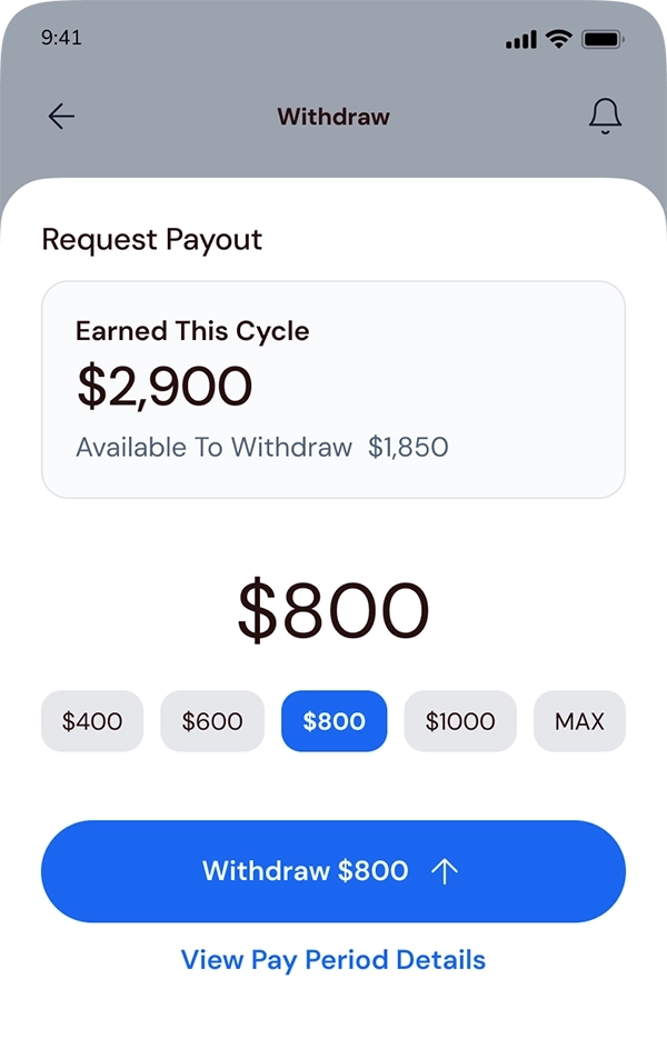
"Safe-to-withdraw" as the Hero Metric:
I elevated “Safe to withdraw” over total earned to reduce mental math and prevent surprise blocks.
Progressive Disclosure for Rules & Fees:
I kept the UI calm, but surfaced fees, limits, and ETA exactly when they impact the decision.
Intentional Friction at Critical Moments:
I added intentional “speed bumps” (re-auth + clear confirmation) to prevent impulsive mistakes with high amounts.
From Payout Tool to Wellbeing Companion:
I introduced optional insights to support healthier habits without slowing the payout loop.
In the competitive fintech landscape, the default pattern is one-tap withdrawal. I deliberately avoided it.
For an employee under financial stress, speed without clarity creates regret, anxiety, and support tickets. So I designed for fast action – but only after the decision feels safe.
Four design decisions that made trust usable:
UI pivot - make “Safe to withdraw” the decision anchor
I restructured the screen to answer one question in seconds:
what’s safe to withdraw today – and why.
- Before -
Earned-first:
Total earned led the screen, so the safe amount wasn’t the decision anchor and limit context was easy to miss.
- After -
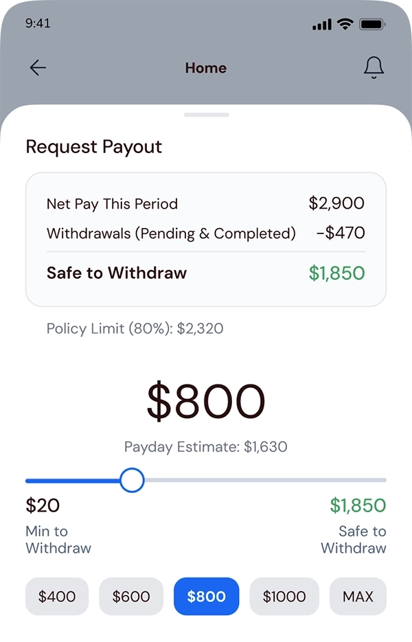
Safe-first:
“Safe to withdraw” becomes the primary number, so the decision is clear upfront.
Limits visible:
Policy limit and pending/completed withdrawals stay visible in context while choosing.
Trust signals we made explicit before commitment
Trust signals were made explicit before commitment by showing fees, limits, ETA, and security cues upfront – so employees confirm with certainty, not hope.


Competitive analysis revealed where early pay apps hide costs and blocked states
Competitive analysis showed where early pay apps hide costs and blocked states – helping define what needed to be explicit before commitment.
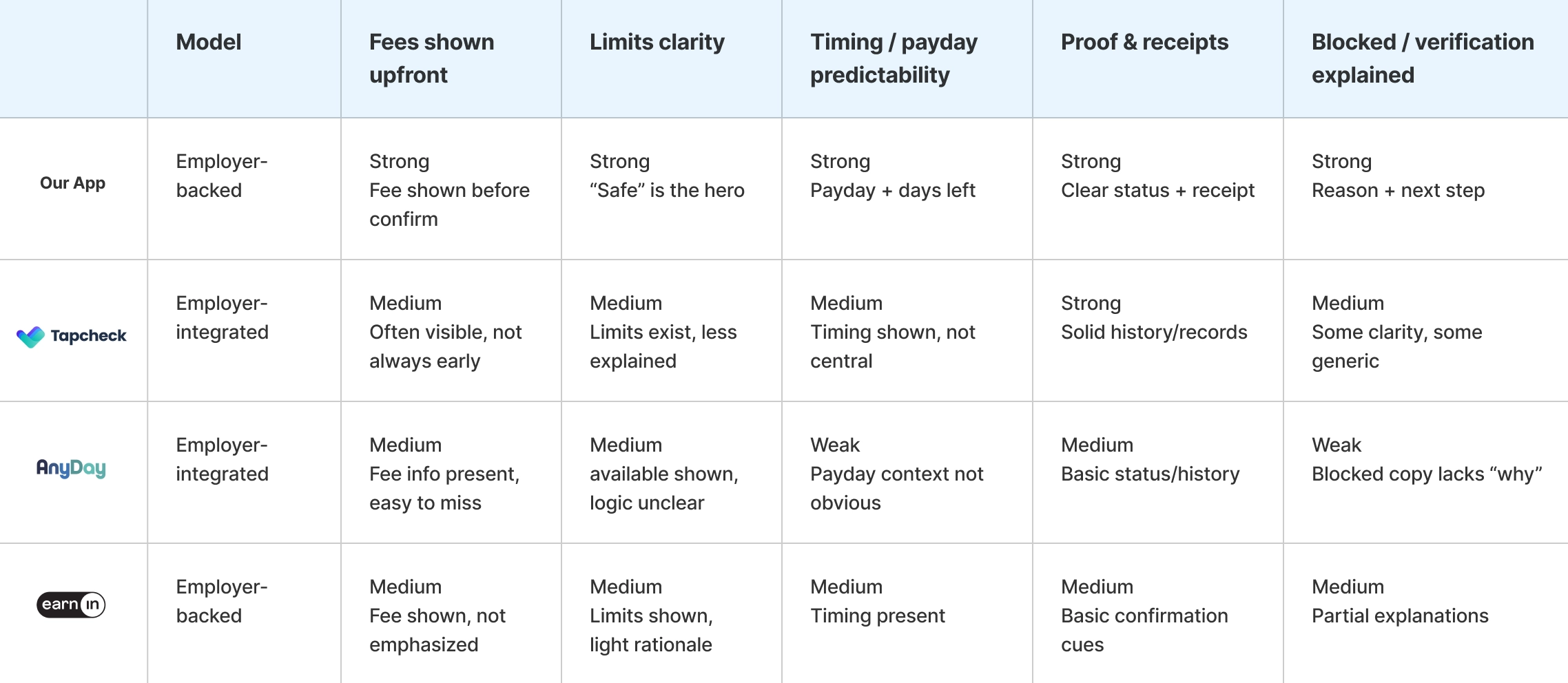
Competitive research on trust signals and failure states across early pay apps
Competitive research showed where competitors hide fees, limit logic, timing, and blocked or verification states – and those gaps helped define what needed to be explicit before commitment.
Pinch to Zoom
Cmd/Ctrl + scroll to Zoom
Solution & Execution
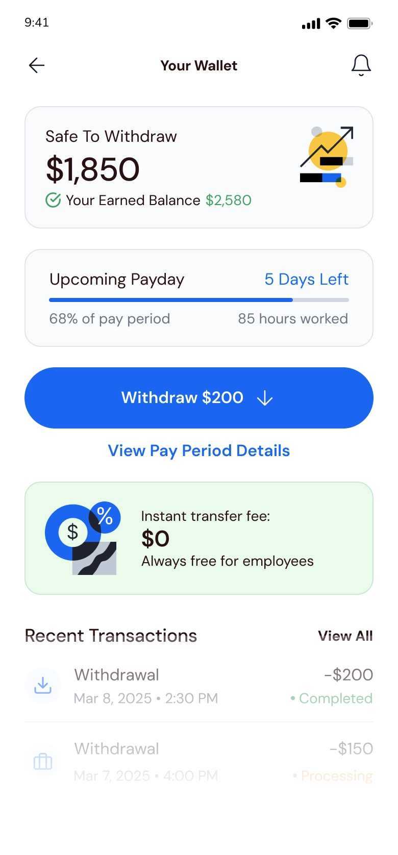
A repeatable loop: check availability - confirm - track status
I structured the experience around one repeatable loop: see what’s available today, confirm with full context, and track progress until it’s completed – so employees never have to guess where their money is.
The core flow removes uncertainty before you confirm
The loop is designed to be repeatable and free of guesswork, directly addressing the “where is my money – and when will I get it?” anxiety.
Onboarding: Verify fast with employer and payroll context, with prefilled details where possible.
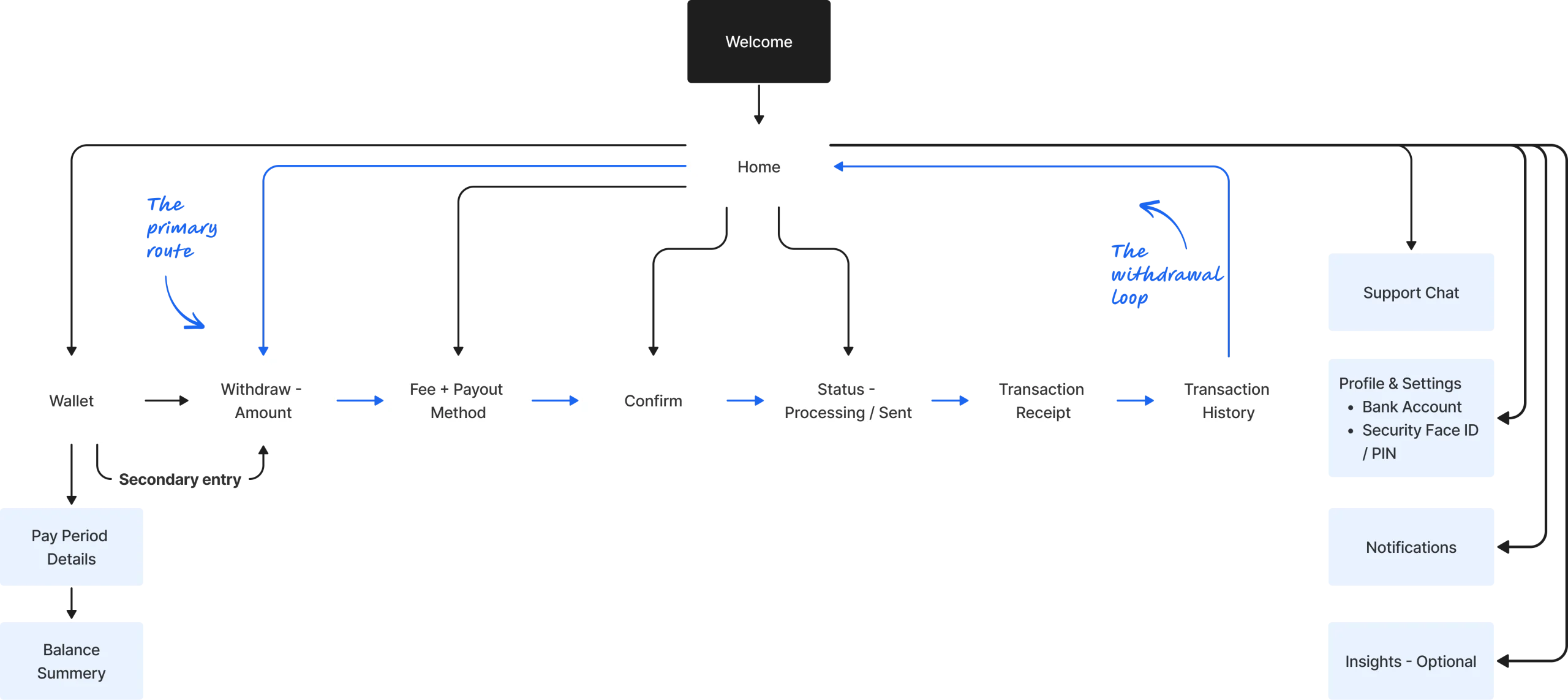
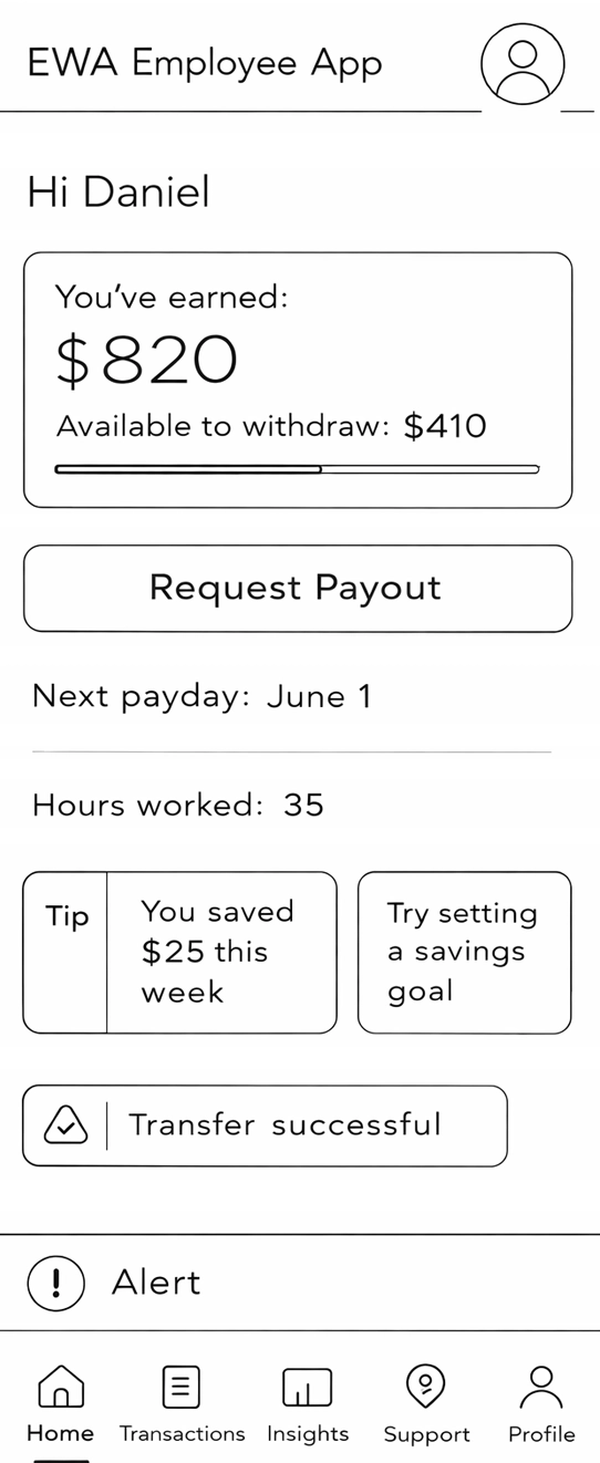
Balance: Home prioritizes “Available today” plus next pay date, with one primary CTA – Withdraw.
Withdraw: Start from a safe recommended amount; show fee, ETA, and paycheck impact before confirm.
Status: Track Processing – Sent – Completed, with a receipt-style Transaction Details and history by pay period.
Balance
Withdraw
Status
Onboarding
Repeatable
path to certainty
path to certainty
Balance
Foreground “Available Today” → Single CTA
Withdraw
Safe amount →
Fee context →
Confirm
Status
Processing → Sent → Receipt
Onboarding
Verify identity → Frame as benefit
The information architect is loop-first, built around the withdrawal path
I designed the screen map around one repeatable loop – check availability, withdraw, then track status. Home is the hub, while Wallet, History, and optional Insights stay accessible without competing with the primary route.
Key screens - each answers one trust question, fast
These screens form the backbone of the withdrawal loop: see what’s Safe to Withdraw, confirm with clear fees and timing, and track status until completion.
The Core Loop: From Awareness to Action
Home is the visibility hub that turns earned pay into a clear Safe to Withdraw decision, so employees can act with confidence and confirm without second-guessing.
Contextual Balance: Separates earned vs safe-to-withdraw to prevent overdrafting.
Recent activity:
Confirms where the last payout stands at a glance.
Support-light by design:
Answers “How much can I take?” and “When is payday?” upfront.
The Confidence Loop: High-stakes actions require zero-noise interfaces.
Withdraw is the commitment moment. The UI reduces “hidden cost” anxiety by making the decision explicit and fully explained before confirmation.
The Hero Number: Anchor the decision on Safe to Withdraw to eliminate mental math and prevent overdrafting.
Financial Foresight:
Preview the next paycheck impact in real time so users understand the tradeoff upfront.
Zero Guesswork:
Show fees and ETA before the final commit to build financial trust.
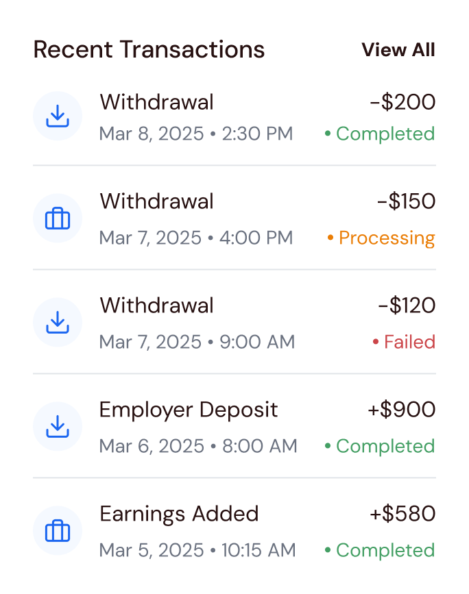
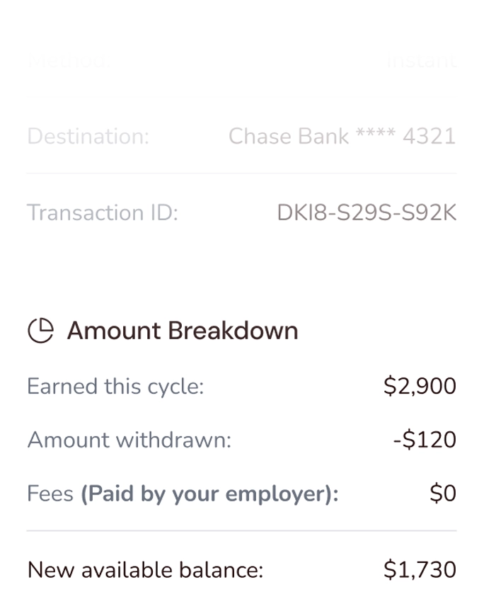
Payout Infrastructure & Certainty
Trust isn’t just about receiving the money – it’s about knowing where it went, what happened, and having a clear record to prove it.
Destination clarity:
The Wallet screen confirms the linked bank account and payout method to prevent “missing funds” anxiety.
Continuous tracking:
A single, real-time history shows each request status (Processing, Completed, Failed) in one place.
Digital receipt:
Transaction Details provides timestamps and a transaction ID as proof, reducing post-withdrawal stress and support inquiries.
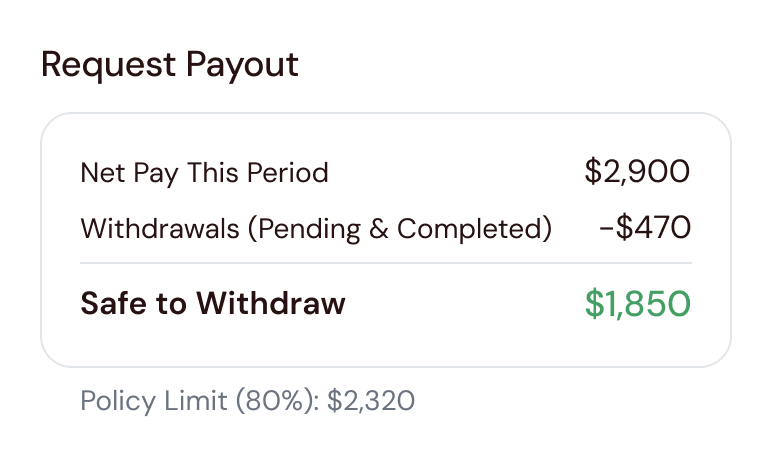
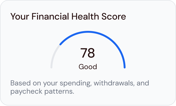
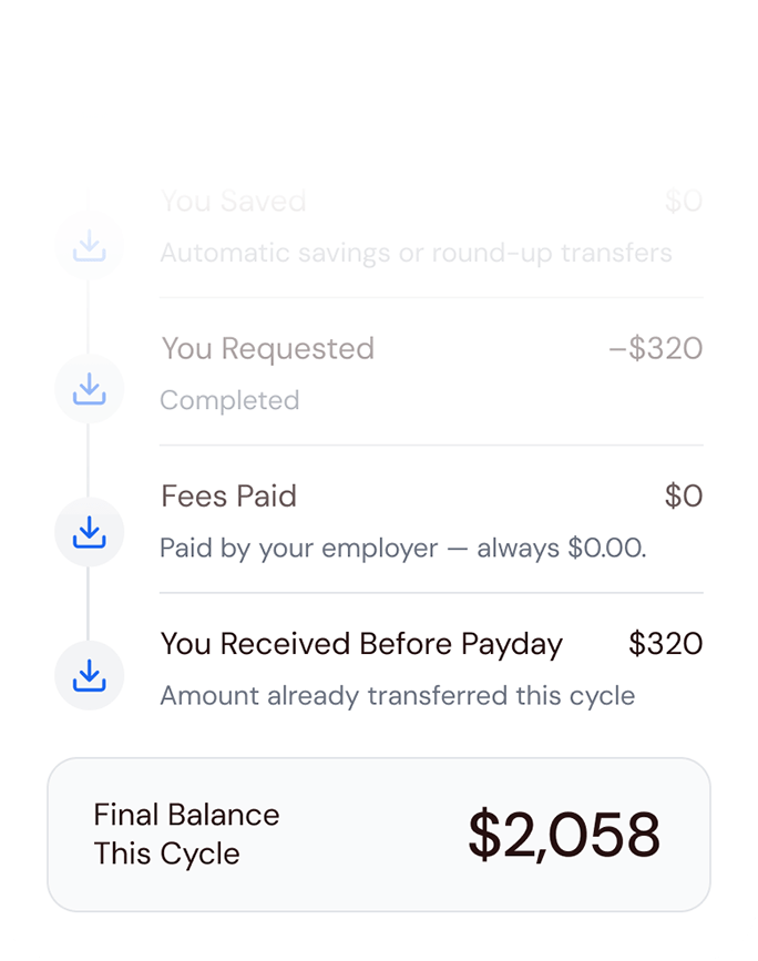
Financial Transparency & Logic
To make early pay feel employer-backed and predictable, I made the payroll math explicit and easy to scan. When “Available” is explained as logic, limits feel like guardrails, not surprises.
Logic as a Trust Builder
Pay Period Details visualizes what drives “Safe to Withdraw” over the pay cycle, and surfaces fees ($0) in context, so the product reads as a workplace benefit rather than a loan.
Financial Wellbeing & Habits
I kept the core withdrawal loop fast, and added an optional wellbeing layer that helps employees notice patterns and make more informed choices over time.
Data-driven empowerment:
Insights visualizes usage trends to help employees plan their month.
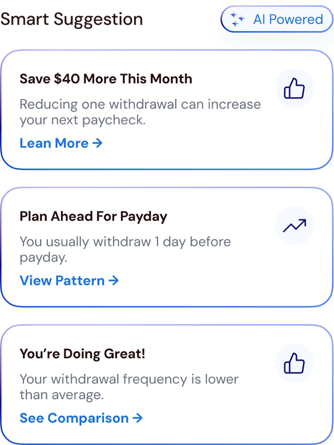
Smart suggestions:
Lightweight prompts turn patterns into next steps, without interrupting withdrawals.
States & Edge Cases - Designing for Trust
In a financial product, trust is tested when things don’t go perfectly. I treated edge cases as first-class UX, so employees always know what happened, what it means, and what to do next.
The Challenge & Constraints
Live Status Tracking:
Replace static history with clear states (Processing, Completed, Failed) to reduce “where is my money?” uncertainty.
Math over Mystery:
Make limits explainable by showing the logic behind availability, so a limit feels like a rule, not a blocker.
The Challenge & Constraints
The Digital Receipt:
Provide a detailed breakdown with timestamps, transaction ID, and fee confirmation, so employees have proof and clear reference points.
Iteration - Removing Mental Math
The final confirmation is the highest-friction moment in the flow. Even a simple “Confirm” button can trigger last-second mental checks – is there a fee, where is it going, and how fast will it arrive.
The Pivot: The flow moved from a generic confirmation button to a consolidated Summary Card paired with a Slide-to-Confirm gesture.
The Refinement: The card surfaces the decision checklist in one glance – destination, fee ($0), and ETA – while the slider replaces accidental taps with deliberate intent.
The Result: The confirmation step became clearer and harder to mis-tap, reducing last-second doubt around fees, timing, and destination.
Before - Tap to confirm:
Easy to mis-tap, easy to second-guess.
After - Slide to confirm:
Deliberate action with the full checklist visible.
Outcome & Impact
From paycheck stress to trusted early withdrawals
Reduced employee uncertainty and drop-offs through transparent Safe-to-Withdraw design found in prototype testing.
Key improvements:
Task success
+
0
%
Withdrawal time
-
0
%
Blocked confusion
-
0
%
Outcome + Learnings
Trust by design, without overclaiming
Pre-launch, we defined success through trust proxies – signals that show employees feel informed and in control before confirming a withdrawal.
What we can claim from the work to date:
The design makes key trust inputs explicit: employer context, fee clarity, limit logic, and end-to-end status visibility.
The IA supports a short, repeatable loop (onboarding – balance – withdraw – status) with supporting screens kept secondary.
What we will not claim here (no verified results yet):
Adoption uplift, conversion improvements, fewer support inquiries, SUS/NPS changes, or time-to-withdraw benchmarks.
Next steps (high-impact, measurable):
Instrument onboarding and verification drop-offs (segment by payroll type and transfer method).
Track time-to-first successful withdrawal and pending-to-completed resolution time.
Key learnings:
In financial products, small moments of clarity or confusion have outsized impact on trust.
“Safe to withdraw” is the number employees rely on more than “maximum possible.”
Early pay works best as part of a wellbeing journey: guidance plus transparency, not a standalone cash-advance feature.