Designing an Employer Control Center for Earned Wage Access
From fragmented payroll insights to clear control
In high-turnover industries, employers often manage Earned Wage Access (EWA) through a chaotic web of emails, chats, spreadsheets, and shift logs. This fragmentation leads to asignificant “blind spot” regarding how wage access affects cash flow, compliance, and staff retention.
As the Lead Product Designer, I spearheaded the creation of a B2B Employer Control Center that transforms this operational chaos into a strategic advantage.
Duration
6 Months
Product
B2B Saas Platform
FIELDS
FinTech
The Challenge
When Payroll Operations Become Fragmented
Employers were managing wage requests across disconnected tools with no single source of truth. This lack of integration forced managers and HR teams into manual cross-checks, resulting in three primary operational losses:
Blind Spots: No shared view of risk, policy violations, or the program’s impact on retention.
Lack of Truth: Disconnected data across scheduling, payroll, and banking tools.
Manual Overhead: Informal requests requiring tedious manual verification and approval.
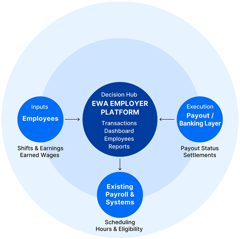
The platform unifies a fragmented ecosystem employees, payroll and scheduling systems, and banking/payout layers into a single, coherent employer control center. This integration supports the core objective: enabling fast, confident managerial decisions while systematically reducing compliance risk through automated, policy-driven workflows.
EWA EMPLOYER ECOSYSTEM The complex environment we unified
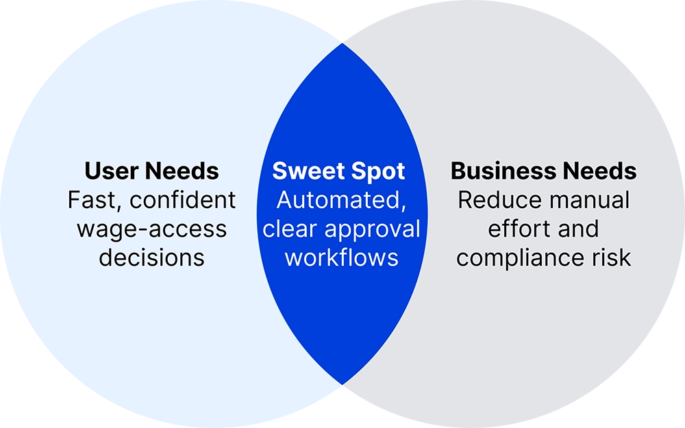
ALIGNING USER AND BUSINESS GOALS Our target: fast decisions & compliance safety
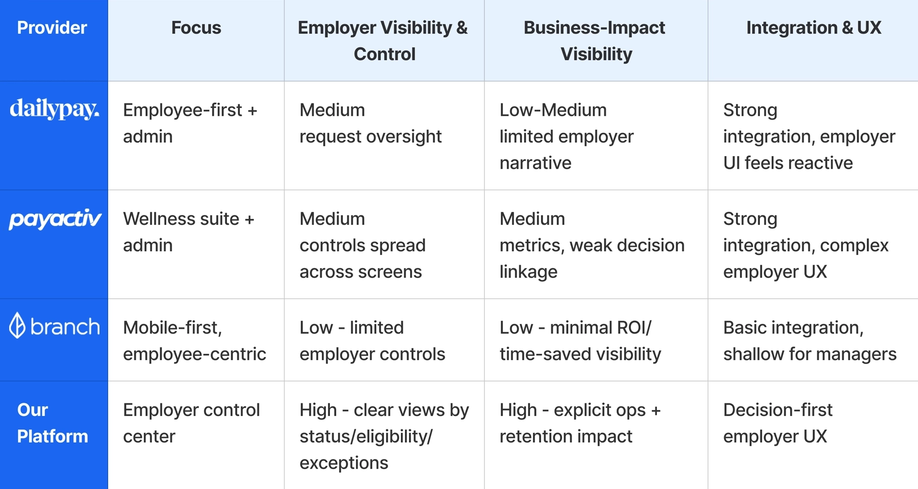
Competitive analysis shows no insight-driven employer view
A competitive analysis of direct and indirect EWA solutions revealed a clear gap. Most platforms either prioritize the employee experience with minimal employer control, or offer heavy admin systems overloaded with raw, fragmented data. Existing platforms provide data visibility but rarely connect daily activity to business outcomes such as risk, liquidity, or retention.
This gap revealed the opportunity for a control center focused on signals, priorities, and ROI.
Comparing employer visibility, decision support, and business impact across existing platforms.
Employee-First Products, Limited Employer Insight
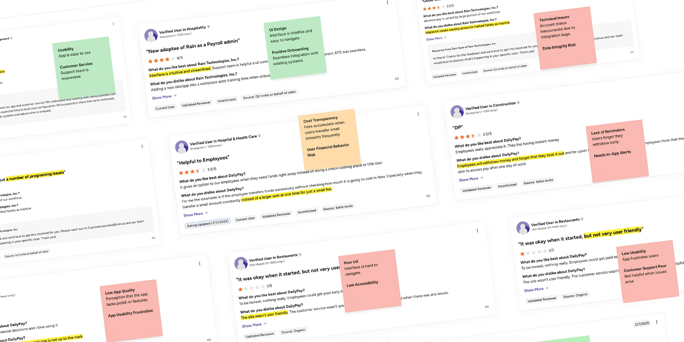
A broader competitive mapping combined product analysis with user review insights. This synthesis exposed recurring patterns: employee-first experiences with limited employer visibility, fragmented admin tools, and weak connections between daily activity and business outcomes.
During the research phase, a recurring sentiment surfaced among managers: they felt they were “approving in the dark”. The core problem was not just the workload of the approval itself, but the lack of context. managers couldn’t see if a decision made sense in the bigger picture.
“I don’t actually see what’s going on... "
Affinity Mapping exposed the absence of insight driven employer decisions
This allowed me to cluster pain points from various personas, such as HR managers at retail chains and small business owners. This research shifted our focus from simply managing a process to providing transparency into patterns, trends, and risk impact.
Through Affinity Mapping, a clear pattern emerged: employers lacked a clear view of usage patterns, risks, and request trends needed to make confident approval decisions.
Pinch to Zoom
Cmd/Ctrl + scroll to Zoom
Design pivot: from data scanning to instant insights
Instead of forcing managers to scan rows of data, we introduced unified KPI and wellness cards that communicate state and trend at a glance. This approach reduces cognitive load and immediately increases decision confidence.
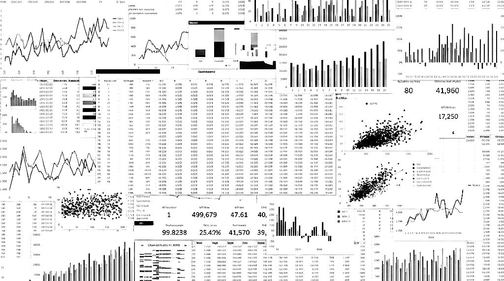
BEFORE
Fragmented tables and charts required manual scanning to interpret program health, risk, and employee behavior.
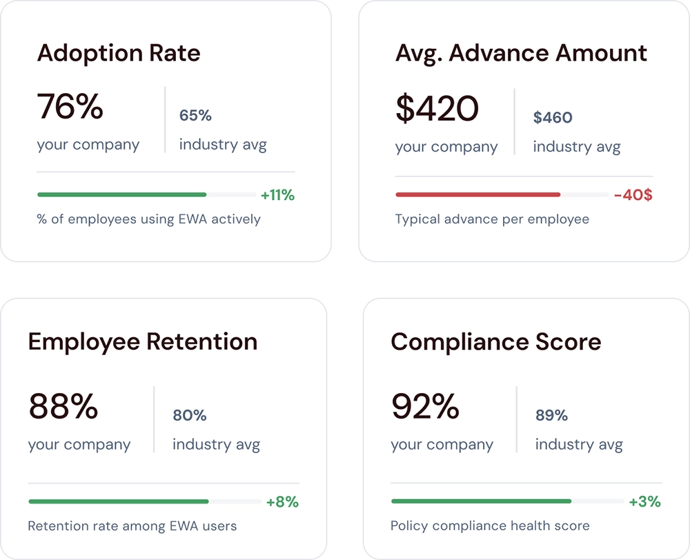
AFTER
Unified KPI and wellness cards surface key signals at a glance, reducing cognitive load and helping managers quickly understand program health.
strategic direction
Defining a decision-driven product strategy
This phase set the strategic foundation of the product. The goal was not to optimize workflows, but to design a system that consistently guides managers from signals to decisions, and from decisions to measurable business impact.
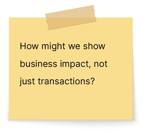
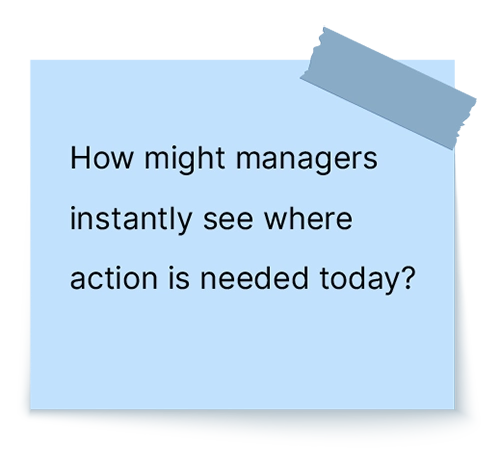
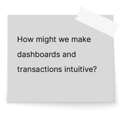
HMW questions reframed the problem around decisions, not data
To translate these insights into a clear product roadmap, I addressed a set of “How Might We” (HMW) questions, specifically:
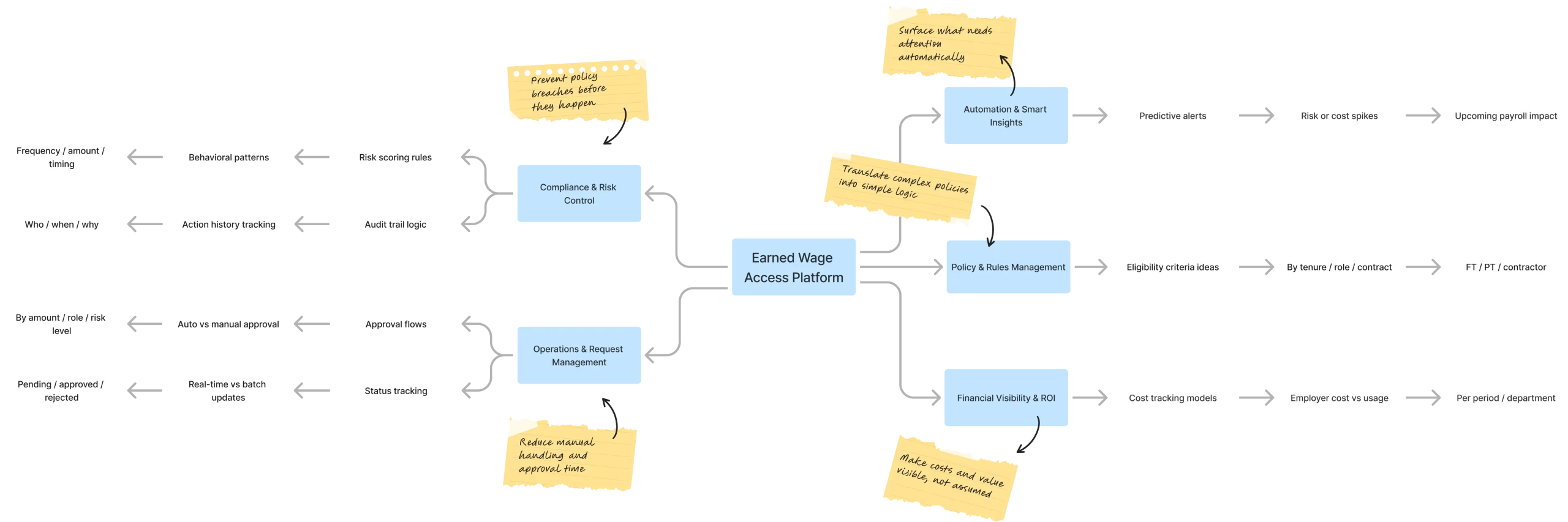
Mind map translated strategic pillars into a scalable product structure
We organized the platform around these pillars, which shaped the core product areas: the Overview Dashboard, Transactions, Employees, and Reports.
Mind map showing how the pillars informed the product structure
Strategic trade-off shifted the system
From data-heavy overviews to insights-first decisions A critical decision involved the dashboard structure. I weighed a Data-Heavy Overview (Option A), which mirrors traditional HR tools, against an “Exceptions & Insights First” approach (Option B).
Option A
Long decision-making time
Industry Patter (Data-Heavy Overview) Traditional data-heavy dashboards common in HR and payroll tools.
Option B
Short decision-making time
Chosen Direction (Insights First) Exceptions & insights-first overview designed to reduce decision friction.
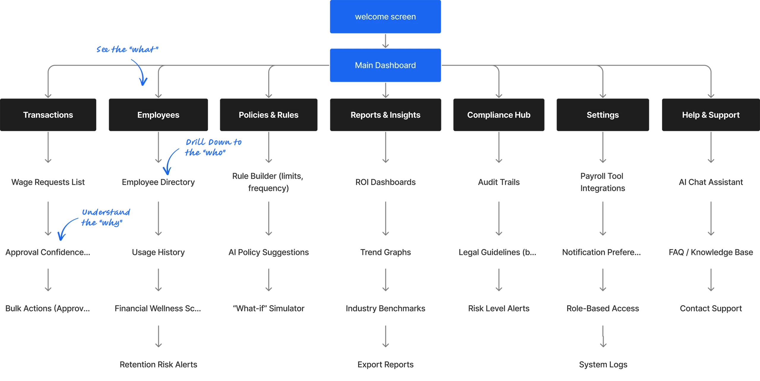
Information architecture connected overview signals to focused action
The structure connects the high-level program overview to detailed event-level views like Employee Details and Transactions, guiding users seamlessly from “what” to “why” to “who.”
How Employees & Transactions fit into the broader employer control center
The Solution
A Decision-First Architecture
Every screen follows a consistent pattern: signals and exceptions first, tables second-guiding managers from ‘what’s wrong now?’ to ‘what to do about it’.
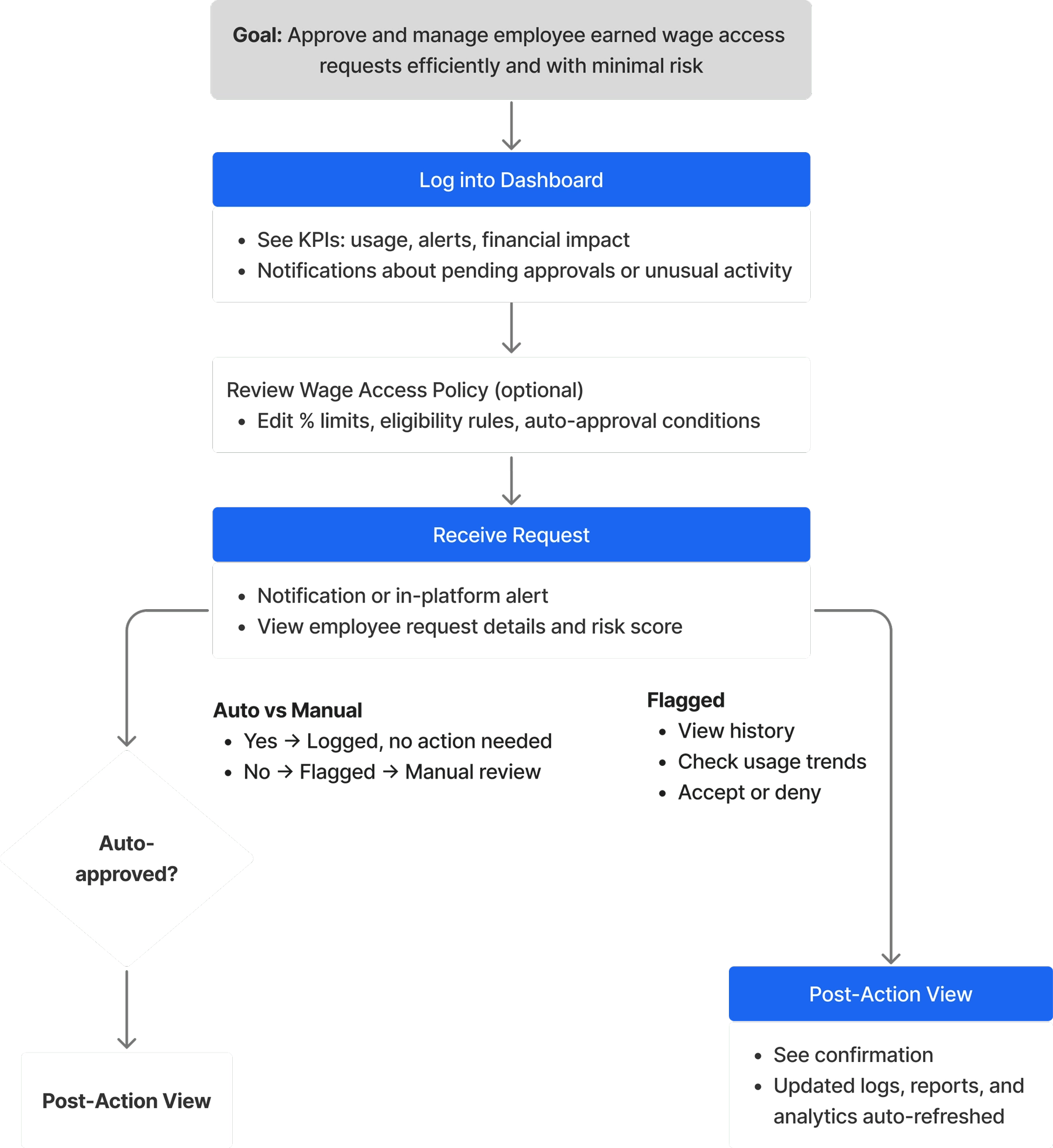
The user flow translates alerts and data signals into clear operational action
This flow maps the employer’s daily routine: from logging in to understand today’s workload, through handling flagged requests, to reviewing the impact of those decisions on overall program health.
A clear employer journey - from daily alerts to resolved actions and measurable impact.
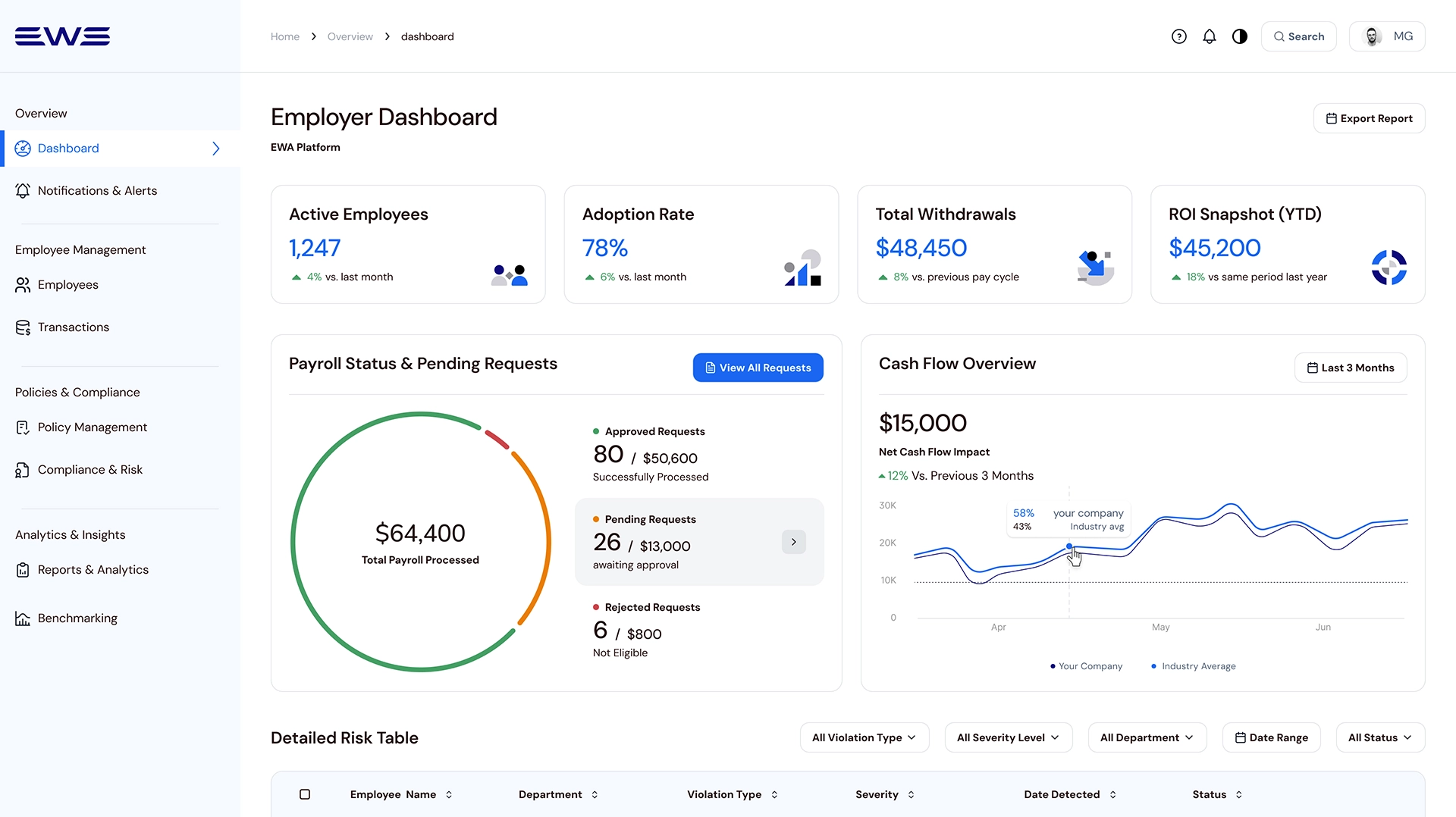
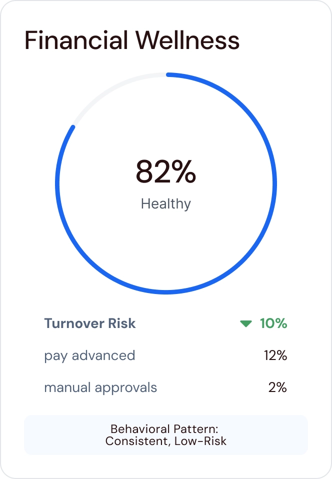
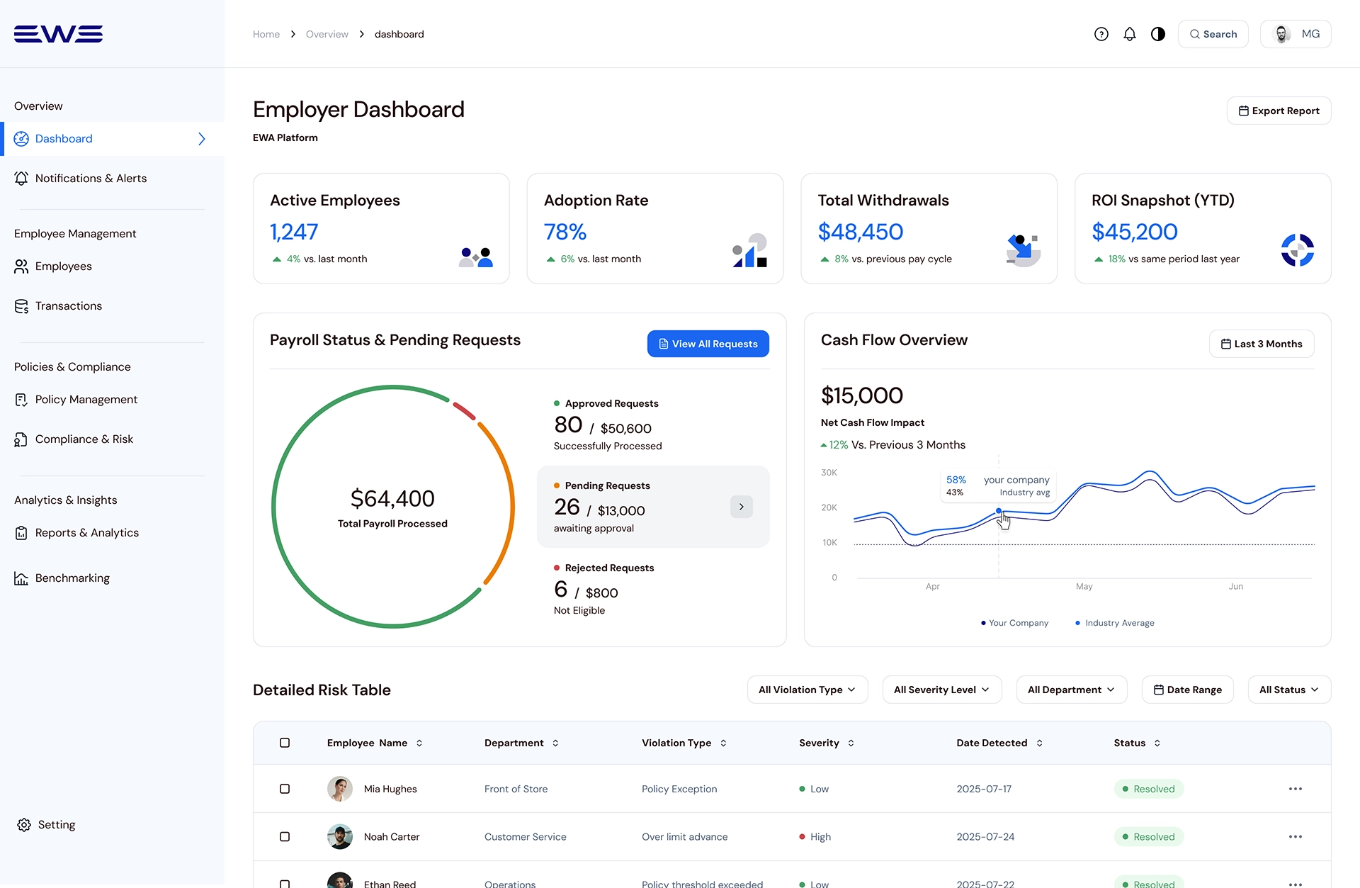
Dashboard Overview – Setting priorities and decision focus
This serves as a “priority-driven” rather than a mere report. It features a top KPI row (active employees, adoption rate, time saved) and insight charts that compare company performance to industry averages.
Top KPI Row:
Quick snapshot of usage, time saved, and retention impact.
Insight Charts:
Company adoption and retention vs industry averages.
Pending & Recent Requests:
Filterable table for reviewing and acting on requests.
Highlights what matters now, then lets employers drill into pending and recent requests when needed – optimized for clarity, focus, and fast, confident decisions.
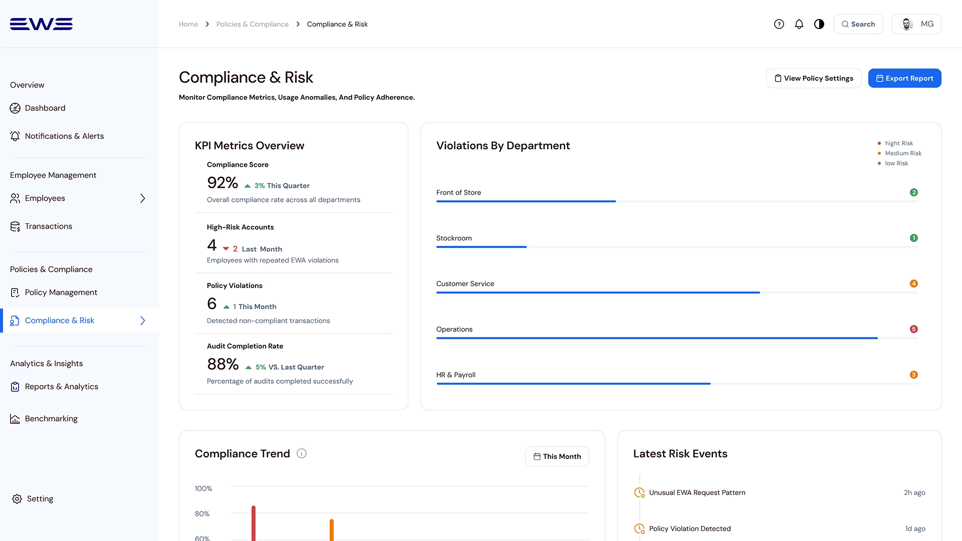
Compliance & Risk – Surfacing risk early to prevent reactive decisions
Applying a decision-first hierarchy, this screen uses the 60-30-10 color rule to draw attention to critical alerts and policy violations. It surfaces “where the problem is now” before showing detailed tables.
Designed to prevent policy drift and reduce compliance risk before payroll cutoff.
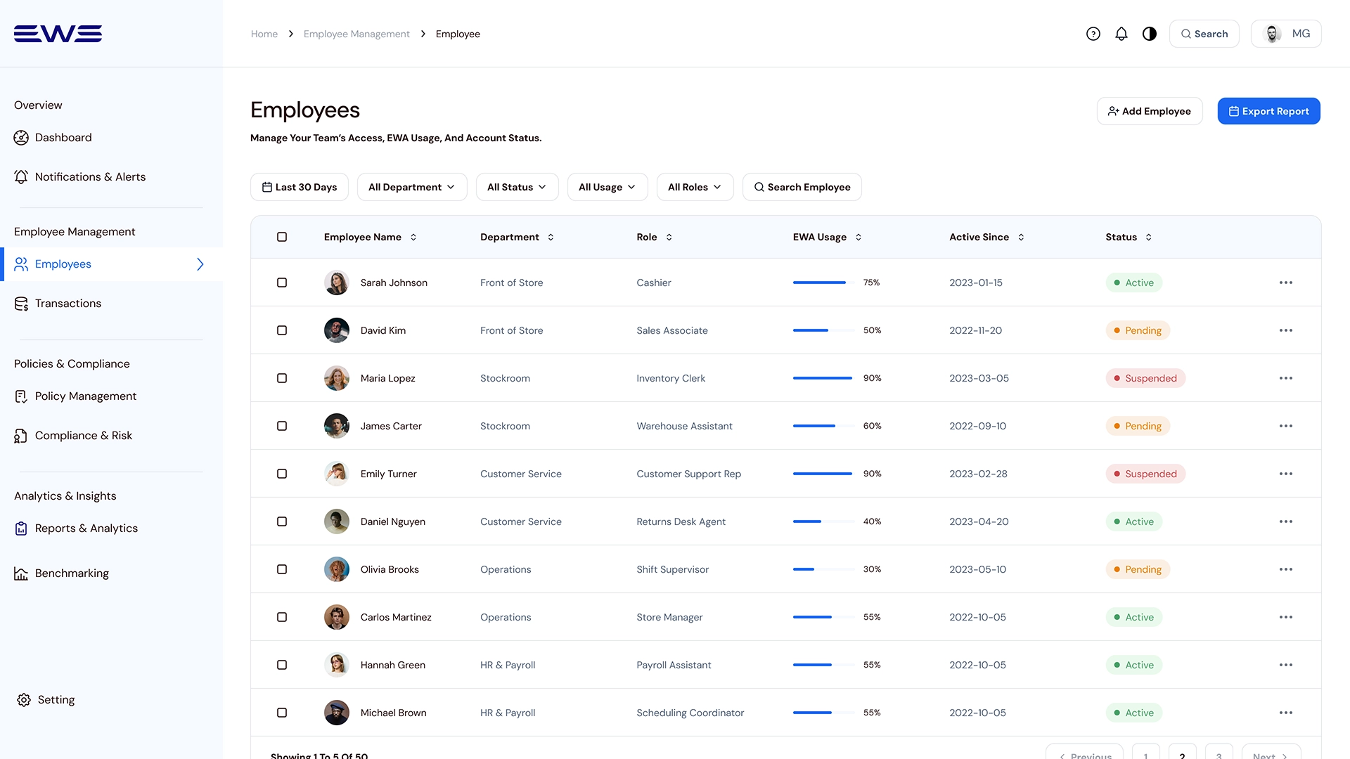
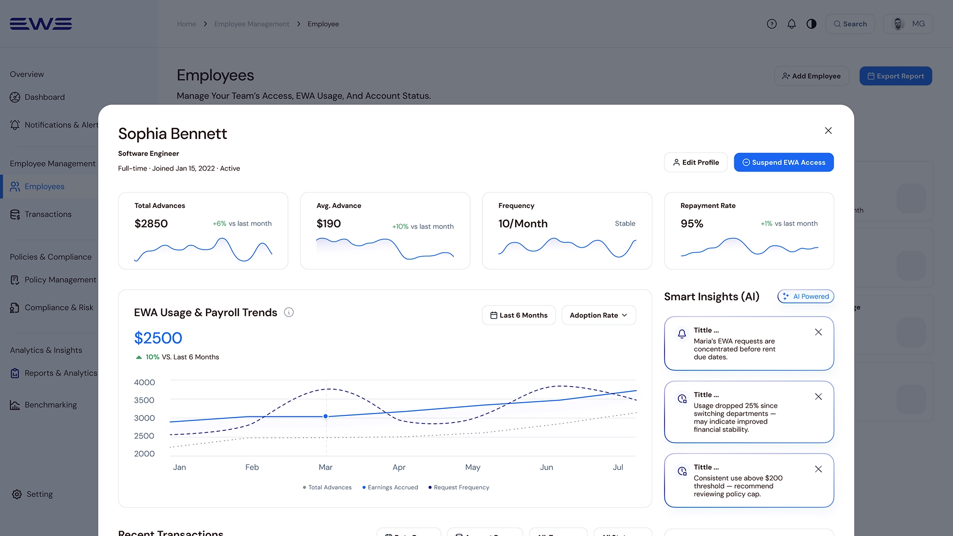
Employee List → Detail Card: From team-level patterns to individual context
This view allows for a fast operational scan. A slide-in detail card provides smart behavioral insights, flagging patterns such as clustered requests before rent dates that may require manager attention.
List-to-detail flow enables managers to scan team patterns and drill into individual employees to identify behaviors requiring intervention - without losing context.
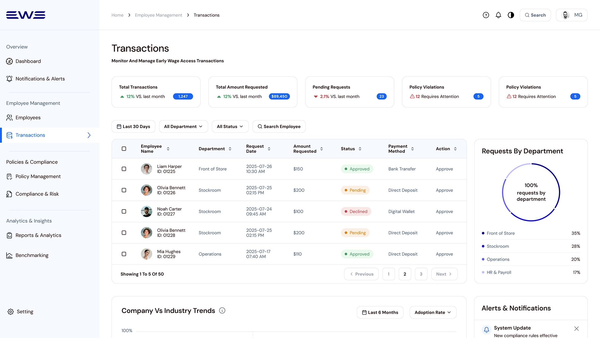
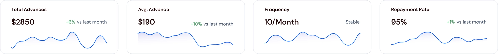
Transactions – Handling exceptions through signals, not raw tables
Intentionally not “table-first,” this screen starts with KPIs and exception signals like pending requests and policy violations. This ensures managers investigate only after higher-level signals are identified.
Transactions serve as an event layer for requests, exceptions, and violations - supporting investigation only after higher-level signals.
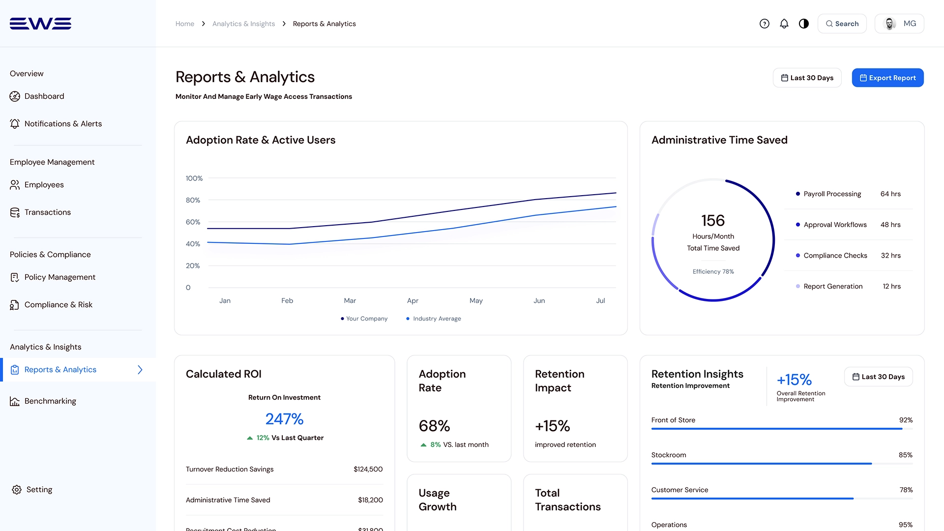
Reports & Analytics – Translating activity into executive-level insights
This view flips the lens from daily tasks to an executive performance narrative, focusing on adoption velocity, operational leverage, and business outcomes like recruitment cost reduction.
Reports & Analytics translate operational metrics into executive decisions - helping leaders decide whether to continue, expand, or adjust the EWA program.
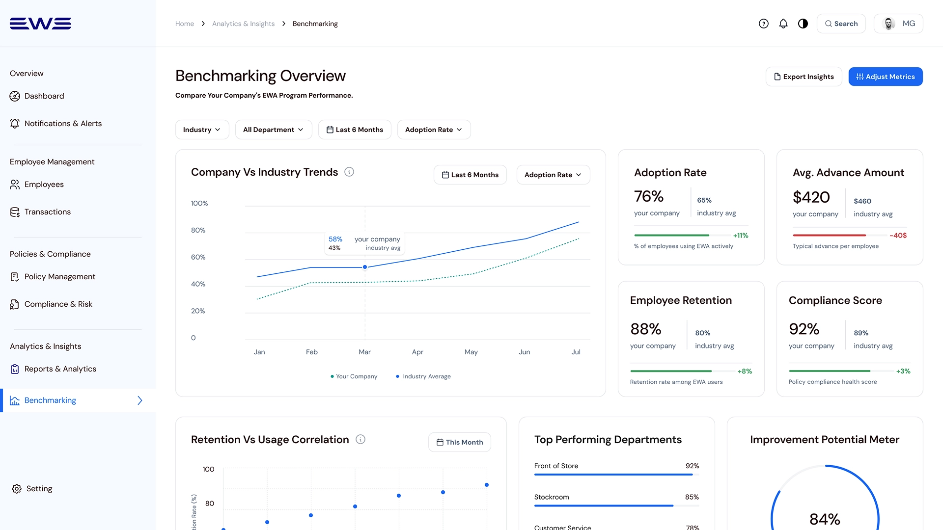
Benchmarking – Validating performance against industry benchmarks
To support strategic validation, this view compares internal EWA performance against industry benchmarks for adoption, retention, and compliance.
Benchmarking validates competitiveness by placing internal performance in market context.
Outcome & Impact
From data overload to decision-ready insights
Reduced managerial decision time and compliance risk through KPI-first design found in prototype testing.
Key improvements:
Task success
+0%
Onboarding time
-0%
Error rate
-0%
Learnings & Reflection
Insight: Designing for the Next Decision
This project demonstrated that a traditional dashboard becomes a vital organizational control center when designed around decision-making rather than just data entry. By prioritizing decision-ready insights over raw data, managers move from “figuring out what happened” to “deciding what to do next”.
Key Lessons:
Decisions over Features:
Reorganizing the system around decision moments reduced analysis paralysis.
ROI Storytelling:
In B2B SaaS, design must communicate business value - time saved, risk reduced, and retention impact.
Trust and Transparency:
In FinTech, audit trails, risk indicators, and policy clarity are as critical as usability.
Closing Insight: Designing for Decision Visibility
As the Lead Product Designer, I reframed EWA from a payout feature into a strategic management tool, aligning stakeholders around decision visibility, risk awareness, and financial wellness signals. I learned that when financial data is structured around decisions instead of transactions, the product becomes a strategic management tool rather than just a payout feature.
The Next Layer: Predictive Decision Support
Predictive risk signals for early financial-stress patterns
Manager guidance translating signals into actions
Deeper payroll integrations for automated eligibility checks